project overview
Rilxer, a cycling and ride business, sought to create a brand identity that captured the energy, adventure, and freedom associated with cycling. The objective was to design a modern logo and cohesive branding that would resonate with cycling enthusiasts and appeal to both professional riders and casual cyclists. The branding was intended to position Rilxer as a go-to destination for cycling services and equipment, emphasizing its passion for performance and community.
design process
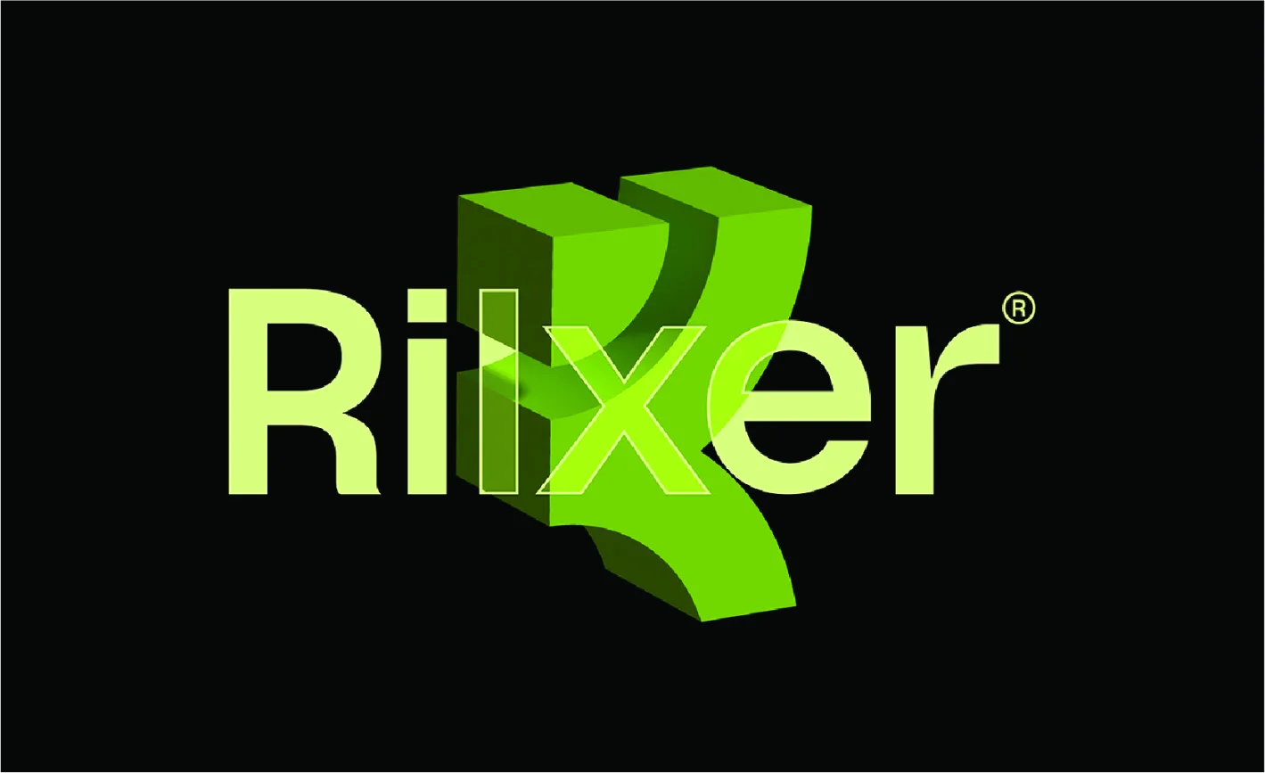
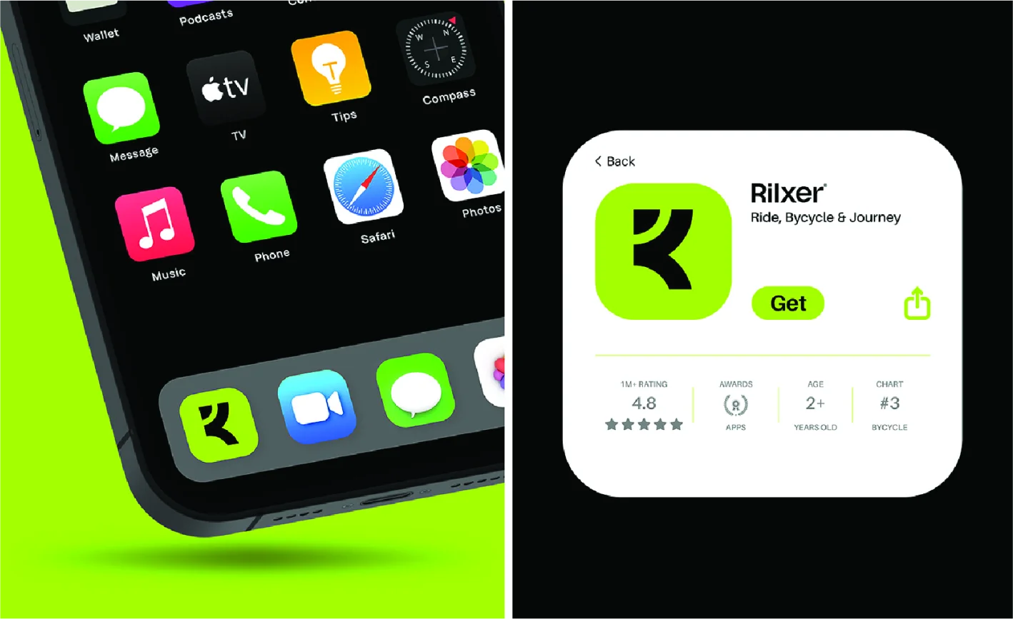
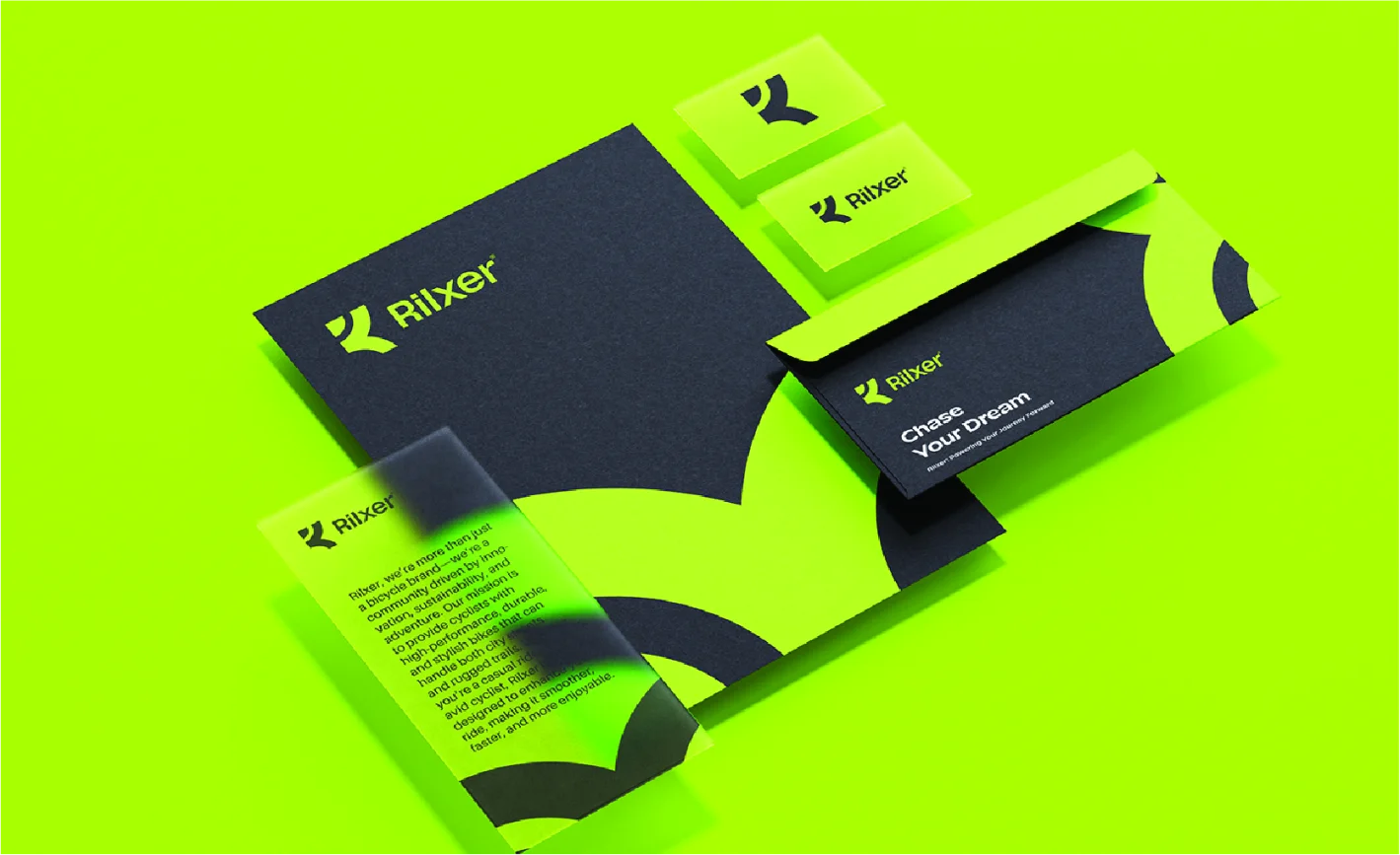
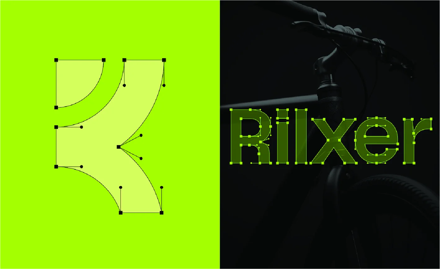
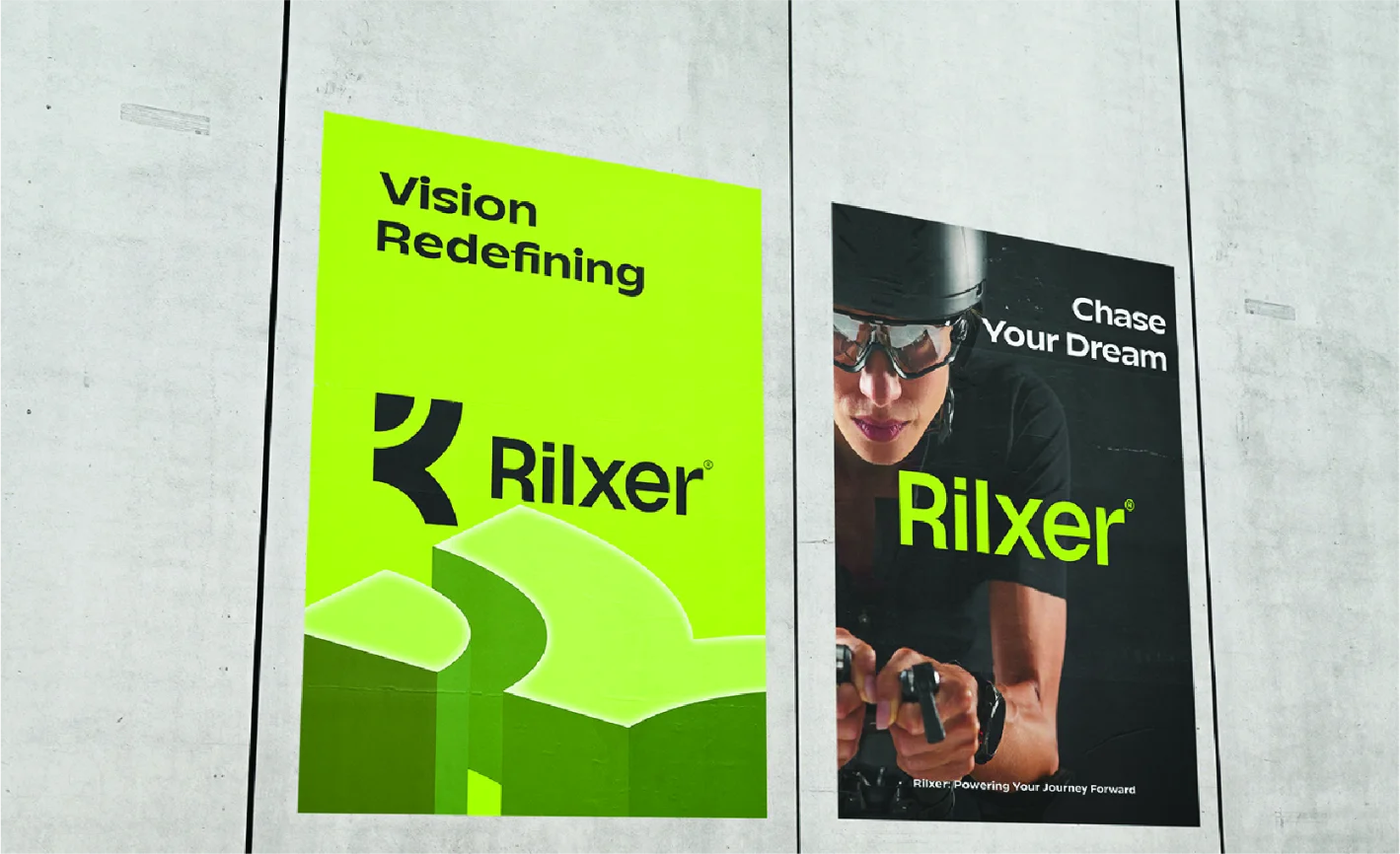
The design process began with extensive research into the cycling industry, exploring trends, competitor offerings, and customer preferences. A logo was crafted to reflect speed and motion, incorporating bold, dynamic typography and a symbol that embodied the spirit of cycling. The brand’s visual elements were extended to ride schedules, apparel, and marketing materials, ensuring a consistent identity. Prototypes of the branding were tested for versatility and functionality in various formats, from digital ads to print materials. After incorporating client feedback, we delivered a complete brand package ready for launch.

The Challenge
Rilxer’s existing branding lacked the modern, energetic feel necessary to attract a diverse group of cycling enthusiasts. Additionally, their visual identity failed to communicate the sense of adventure and performance that defined their services, limiting their appeal in a competitive market.
The Solution
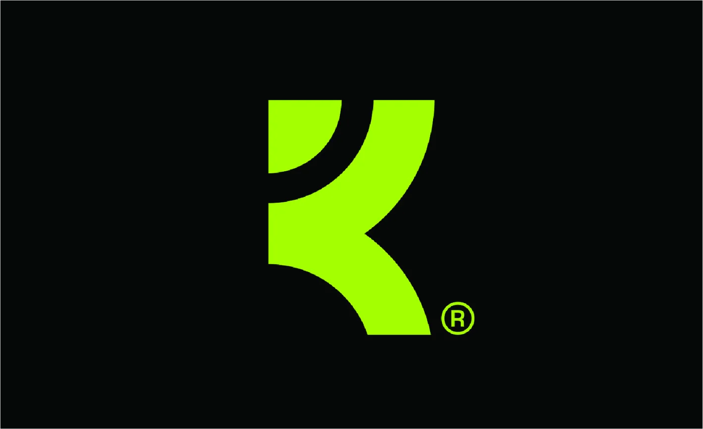
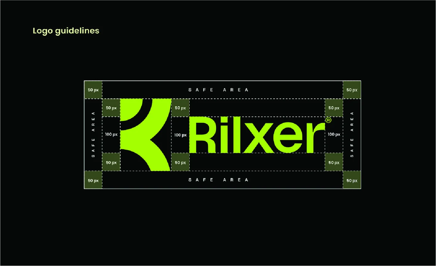
We developed a contemporary logo that captured the essence of speed and excitement, integrating a stylized bike element that conveyed the brand’s focus on both casual and competitive cycling. We applied bold, energetic colors to reflect enthusiasm, while maintaining clarity for easy recognition. The final branding was dynamic, ensuring it could be used across a variety of marketing materials, from digital platforms to product packaging.
The outcome
Following the brand’s launch, Rilxer experienced a 20% increase in membership sign-ups and a 15% increase in merchandise sales within the first two months. The new logo and branding were widely praised for capturing the essence of the cycling experience, and the business saw an improvement in customer loyalty and engagement.
Complete Analysis
Lorem ipsum dolor sit amet, consectetur adipiscing elit, sed do eiusmod tempor incididunt ut labore et dolore magna aliqua. Ut enim ad minim veniam, quis nostrud exercitation ullamco laboris nisi ut aliquip ex ea commodo consequat. Duis aute irure dolor in reprehenderit in voluptate velit esse cillum dolore eu fugiat nulla pariatur. Excepteur sint occaecat cupidatat non proident, sunt in culpa qui officia deserunt mollit anim id est laborum Lorem ipsum dolor sit amet, consectetur adipiscing elit, sed do eiusmod tempor incididunt ut labore et dolore magna aliqua. Ut enim ad minim veniam, quis nostrud exercitation ullamco laboris nisi ut aliquip ex ea commodo consequat. Duis aute irure dolor in reprehenderit in voluptate velit esse cillum dolore eu fugiat nulla pariatur. Excepteur sint occaecat cupidatat non proident, sunt in culpa qui officia deserunt mollit anim id est laborum